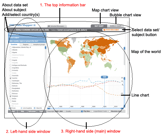
The main (right-hand side) window of Data Mapper is where everything happens and there are two different views of this main window, depending whether you selected the map chart view or the bubble graph view from the tabs on the top information bar.
Map chart view
On the right-hand side of Data Mapper, is the main window in which appears a map of the world (if you have selected the ‘map chart’ tab from the top information bar of Data Mapper). As we have already mentioned, the map of the world appears with varying colours and these correspond to the data intervals associated with the dataset in question. You will notice that there is a scroll bar to the right of the map, which allows you to zoom in on the map. A further feature is that you can move your cursor over the map and hover over a particular country. In so doing the country becomes highlighted and the data corresponding to that country is presented for you to see. If you click the country on the map, it is exactly like selecting a country from the list from the left-hand side window.
Depending on the (a) dataset/subject and (b) country(ies)/regions/groups that you have selected from the left-hand window (or by clicking on the map itself), a line chart will appear just below the map of the world, represents the dataset/country(ies) you have selected plotted over a period of time starting from 1980. This tool thus provides you with a visual aid to compare countries/regions/groups for a particular dataset.
You will note that the line graph has scroll bars on the bottom and right-hand side with two small blue buttons on each scroll bar. By maneuvering these buttons (which turn orange which you click on them), you can adjust the scale of the graph. Another feature of this line graph is that you will see a distinct marker at the top of the line graph indicating a particular year. This is the year of the data in question. You can move this marker left or right. Most of the data sets offer estimations through to 2013 and beyond. Finally, there are two further options below the line graph allowing you to select a logarithmic view of the y-axis of the graph (which only works with selected datasets) and to maximise the graph. There is also ‘play time’ feature which plots each year as a short animation, but the benefit of this is not clear.
Bubble chart view
If you initially selected the ‘bubble chart’ tab on the right-hand side of the top information bar, then a bubble chart will appear in the right-hand side main window of Data Mapper. This bubble chart has two axes. The vertical or y-axis represents the initial dataset/subject you selected when you started your analysis. The horizontal (or x-axis) will initially have no subject associated with it and there will be no bubble graphs appearing in the chart. You will need to select a second subject to compare with your first selection. Thus, if you selected ‘current account balance’ the first time round, then you could choose to compare this with ‘nominal GDP’, for example.
When you have selected your second subject for the x-axis, you will see several bubble graphs appearing in the chart. Some of these ‘bubbles’ are in different colours while the rest are all grey. The coloured ones correspond with the different countries you have selected from the left-hand side window, while the grey ones represent all other countries. The coloured bubbles will also show tags corresponding to the names of the countries you have selected. You may find the grey ones very difficult to see, especially on an LCD monitor. These ‘bubbles’ each represent the coordinates for each country for the two comparative subjects you have selected within a particular dataset.
It gets even more complicated; the coloured bubbles may all appear on top of each other and prove very difficult to distinguish from each other. In order to get the bubbles to become more visible and understandable, you will need to manipulate the scales of both the x and y axes. You do so by maneuvering the two blue buttons that appear on both the top and right-hand side scroll bars – see figure 2 (the buttons turn orange when you click on them). Exactly how you must maneuver them is almost impossible to say with any accuracy. It will depend on the subjects you have chosen and their respective scales. You will need to move the one button a little, followed by the second button on the same scroll bar and then see the result, and then adjust them again. One hint we can give you is to click the top right-hand corner where the two scroll bars meet. This will centre the graph and provide you with a reference point to start from.
Figure 2: Screenshot of bubble chart

One final option available to you is that you may choose to associate a size variable with each bubble. You can do this in the left-hand window in which you will find a further option now available to you called ‘define chart items’ which was not available to you when you selected the map chart view. There are currently three options available to you, namely either GDP, population or none. This is one of the benefits of using bubble graphs, in that you can associate a third dimension with each bubble, represented by the size of the bubble. If you select either GDP or population, the bubbles will all vary in size, representing either the size of the population or GDP of the country depending on which option you selected. You can choose to have no variable (‘none’) associated with each bubble, in which case the bubbles will appear all the same size.
Try it out
We hope that this explanation has made sense to you and that you are able to put the Data Mapper tool to good use. The best way to get to know it, is to use it and try out all of its features. Good luck – we hope that this tool will help you identify great export markets for your products!
