
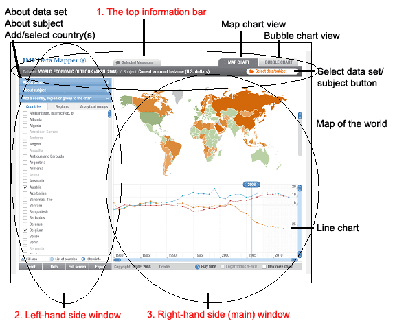
On this top information bar you will find the name of the data set and subject currently being examined. Note that there will always be a subject linked with a dataset, or put another way; a subject stemming from a dataset. We have also mentioned that subjects are further sub-divided into sub-categories and it is really these sub-categories that are listed on the top information bar and not the subject. If you have not yet selected a dataset/subject, the words “none selected” will appear.
On the right-hand side of the bar are two tabs which allow you to switch between the ‘map view’ and the ‘bubble chart view’ in the main window of the Data Mapper. The active tab is dark grey, while the inactive tab is light grey in colour. Just below these two tabs is an orange button (entitled ‘Select data/subject’) that allows you to select the dataset and specific subject that you want to examine. When you click on this button, the data sets and subject choices appear in a new window that opens up over the Data Mapper window. You need to make your choices by highlighting the relevant dataset/subject/sub-category and then clicking on the ‘select subject’ button at the bottom right-hand side of the window. When you do so, the window closes automatically and you are back at the Data Mapper screen.
Selecting a dataset and subject/sub-category is really where your journey on Data Mapper begins.
There is one further tab appearing on the top information bar, called the ‘selected messages’ tab. This option has been added to provide unique views within Data Mapper on selected topics and issues discussed in the World Economic Outlook document. These items should really only be viewed in conjunction with this report. They are not that useful in themselves.