
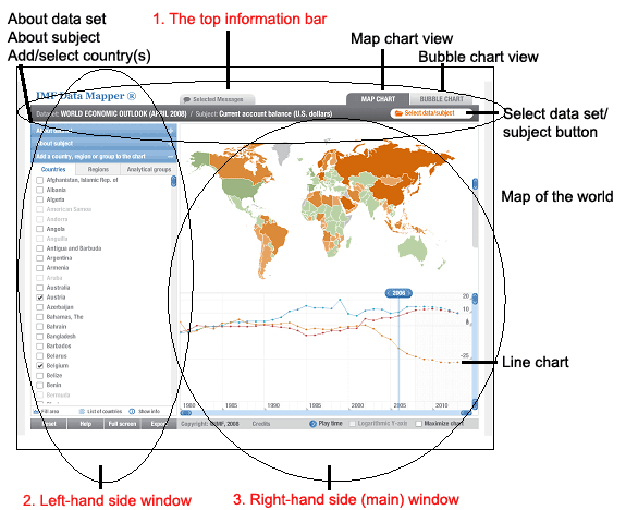
Directly below the top information bar you will find two windows. On the left-hand side is the first window comprising four parts. In this window, you can:
- Learn more about the data set you have selected by clicking on the bar entitled ‘About dataset’
- Learn more about the specific subject you have selected from within the dataset in question by clicking on the bar entitled ‘About subject’
- Select one or more countries/regions/groups (such as developed/developing countries) to study by clicking on the bar entitled ‘Add a country, region or group to the chart’. If you have already selected a dataset and subject, then as soon as you choose a particular country/region or grouping, a line graph is plotted in the map window to the right. Each time you add a new country, an addition line chart is plotted for the new country. The colours appearing on the map of the world in the right-hand side window correspond to the data intervals associated with a particular type of data. For example, in the case of population, the data intervals are:
- 200 million or more
- 25-200 million
- 5-24 million
- 1-4 million
- Less than 1 million
- No data
- Finally, there is a menu bar at the bottom of this right-hand window where you can:
- Reset the map
- Click for ‘help’ – somewhat limited at this stage and does not always provide information
- Choose to open Data Mapper in your full screen – very useful (clicking on ‘Esc’ closes the full screen view).
- Choose to export the data to an excel spreadsheet or capture the chart as an image.