You should first read our explanation below and then try it out on Data Mapper screen. However, before we begin explaining the Data Mapper screen, we need to explain what the underlying data looks like. The Data Mapper tool draws on a number of datasets made available from the IMF and the OECD. Each dataset is further sub-divided into a number of subjects and each subject is further sub-divided into a number of sub-categories.
Note that other datasets will be added over time. Data are available from 1980 to the present, and projections are given for the next five years. For some countries, data are incomplete or unavailable for certain years.
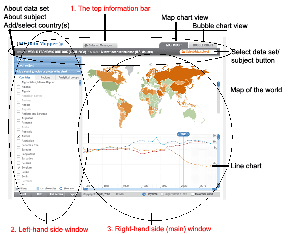
OK, let us move on the Data Mapper screen. You should be aware that the Data Mapper screen has three core components – see figure 1 below: